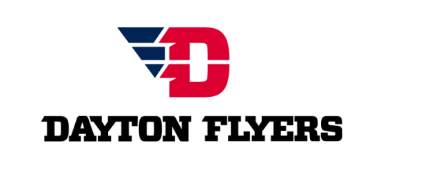
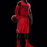
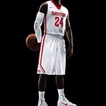
Per CollegeBasketballTalk, the Dayton Flyers received a complete makeover on Friday. The Flyers have a new logo, uniforms and a new court.
I’m a fan of the new uniforms, the logo not so much and the court is decent. The Flyers are fresh off of an elite 8 run and they capitalized immediately upgrading their look.
I’m happy to see the Flyers taking advantage of their run in the tournament. Being from the city of Dayton it is cool to see them get some shine, maybe it will help they keep on the upward trend.
Check out the Flyers new look and let us know what you think!
#NewCourt #NewLogo …Same rich tradition! pic.twitter.com/e9lUdJ6VLk
— True Team Basketball (@DaytonTrueTeam) July 18, 2014
